
House2Home
House2Home

Project: Web Design, Design Sprint
Role: UX Researcher, UX/UI Designer
Tools: Sketch, Figma
Duration: 1 week
Problem
Living alone and having your own space for the first time is a very exciting step for many recent graduates and young professionals. There are many details and tasks that need to be checked off your to-do list when moving to a new city and it may feel overwhelming at times. Something that is essential to making your new space feel like home is decorating it to fit your own personal style. While decorating may seem fun and exciting, it can also be frustrating to get the look & feel that you want on a budget. After hours of scrolling through Pinterest, you probably gathered many photos as inspiration for what you want to recreate in your own home. Now the hard part is finding similar items that will work for your space and fit within your budget.
Solution
House2Home strives to make it easier for people to decorate their new home on a budget.
User Flow

Sketching
Once I understood the problem and mapped out what the user flow might look like, I sketched out possible solutions for the most critical screen using the Crazy 8s method. The critical screen that I chose for this exercise was the screen where users would browse through the design layouts and decorative items included. I chose this screen because it’s an essential step in the user’s process and there were many different & complex ways to design it.
After the Crazy 8s exercise, I created a solution sketch, a three-panel board including (1) the screen before the critical screen, (2) the critical screen itself, and (3) the screen that comes after.
Crazy 8s
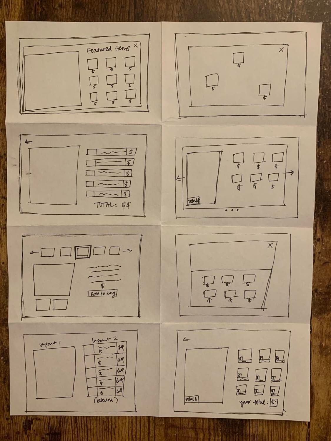
Solution Sketch
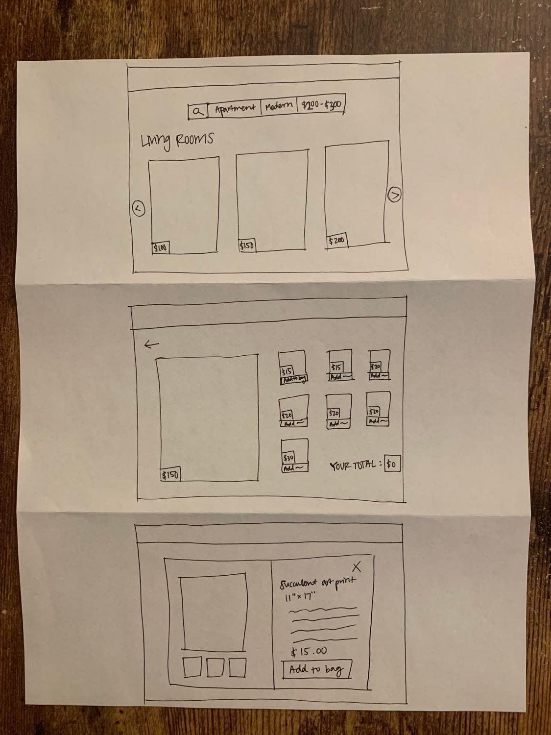
Creating a Storyboard
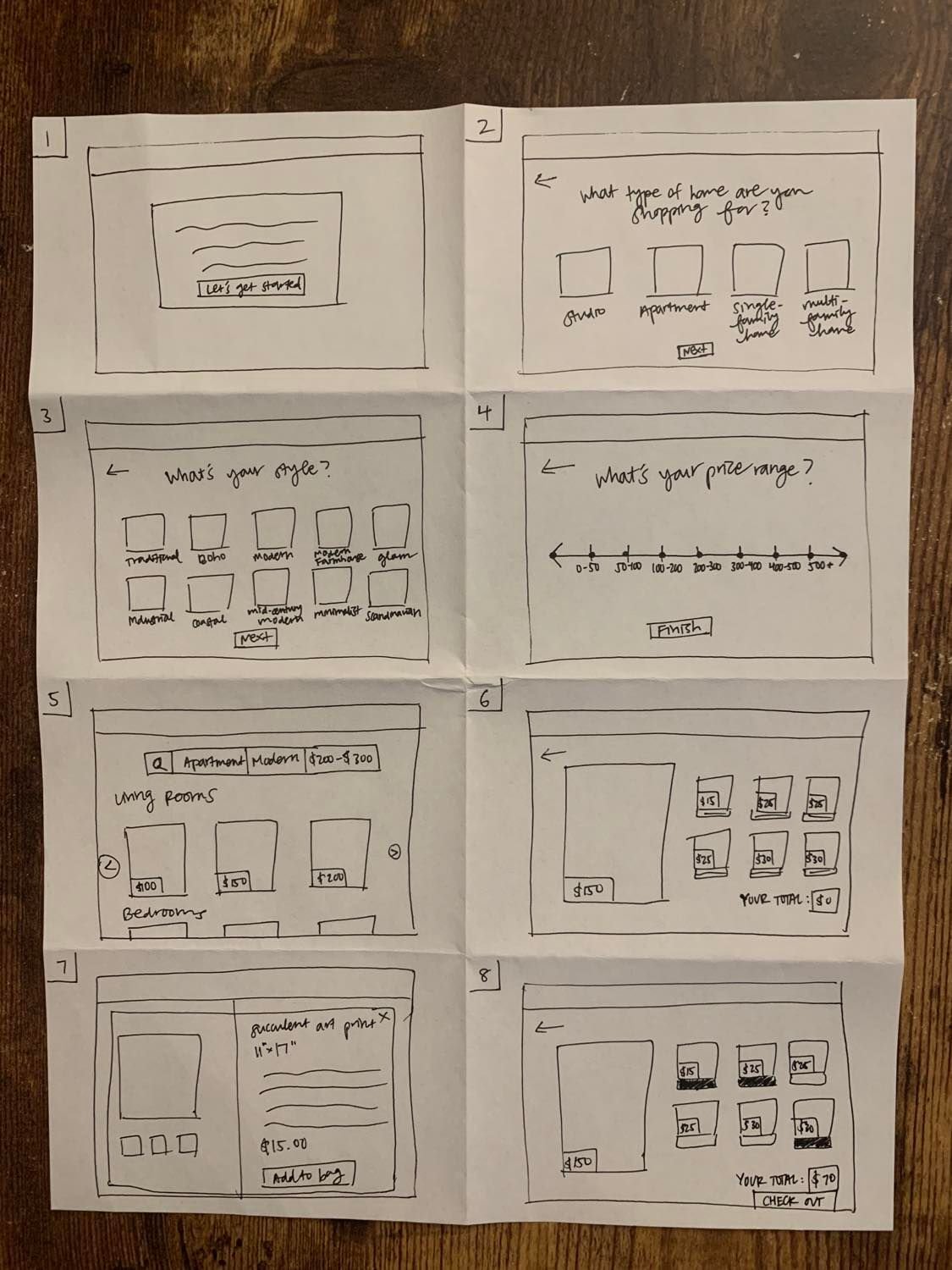
I created a storyboard of the user’s experience with House2Home from beginning to end. Users would start by filling out a short survey, indicating their home type, style, and price range. Then, House2Home will provide a variety of interior design layouts that align with their selections. From there, users can browse the different layouts, check out the individual items that are included in each interior design layout, and purchase those that they’re interested in.
Prototyping
Using the storyboard that I created, I designed high-fidelity mockups of each screen and created an interactive prototype.


Usability Testing
I conducted 5 moderated usability tests in total. All participants were either planning to move into a new home soon or had recently moved into a new home. They are also all young professionals who are looking to decorate their new home on a budget. Overall, I learned a lot from conducting these usability tests and observing participants while they navigated through the website. They provided very valuable feedback and insight for me to make future improvements to House2Home.
Key Findings:
Participants were confused on if House2Home also offered the furniture included in the photos.
Recommendation: Provide additional clarification on the home page stating that House2Home specializes in small, decorative pieces that enhance the beauty of the room rather than larger, functional pieces like furniture.
Participants were confused on if the prices listed included everything in the photos or just select items.
Recommendation: Add a note on the page stating that the prices listed only include select decorative items.
Recommendation: On the price range question during the style survey, rephrase the question to ask “What’s your price range for decorative items?” instead of “What’s your price range?”
Participants felt that the “search” icon on the Results page was unnecessary and a bit confusing. It didn’t signal to them that they would click on it in order to edit their selections.
Recommendation: Instead of including the “search” icon, I could make the individual labels into clickable buttons. For example, if a user wanted to edit their style selection from Boho to Modern Farmhouse, they could click on the Boho button to make this edit.